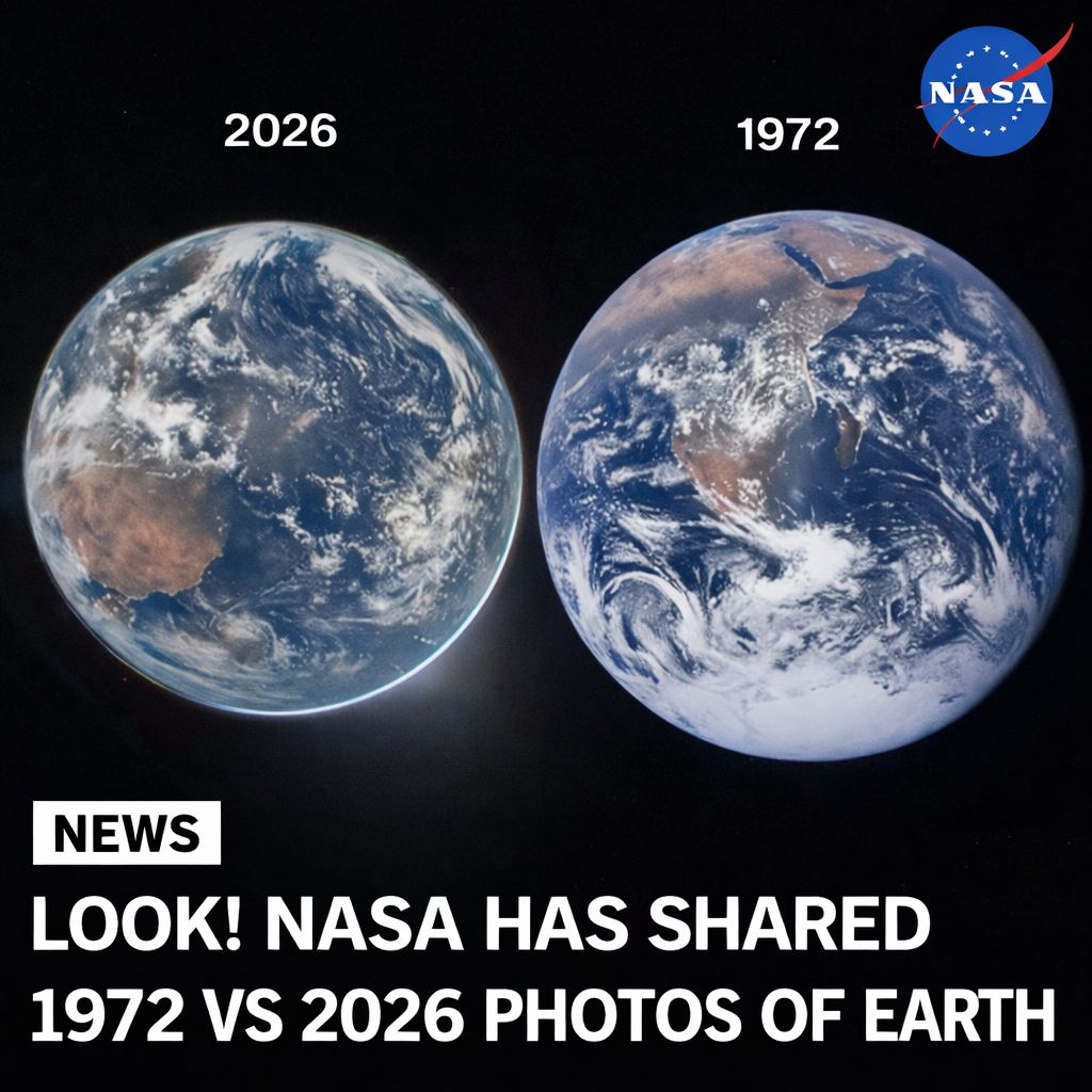
More than half a century apart, two images of Earth have sparked fresh curiosity about how we see our planet from space. Recently, NASA shared a side-by-side comparison that quickly caught global attention. On one side is the famous The Blue Marble image taken during Apollo 17 in 1972. On the other is a newly captured view titled “Hello, World,” taken by Reid Wiseman during the Artemis II mission from the window of the Orion spacecraft.
At first glance, many people online pointed out a striking difference: the 1972 image appears sharper, brighter, and more colorful than the modern one. This observation led some to question whether Earth itself has changed visually over time. However, the explanation is rooted not in planetary transformation, but in physics, lighting, and photographic technology.
The “Blue Marble” photograph remains one of the most iconic images ever taken. Captured when the Sun was positioned directly behind the camera, Earth was fully illuminated. This direct lighting enhanced the vibrancy of oceans, clouds, and landmasses, making colors appear rich and highly defined. Additionally, the image was taken using film photography, which naturally enhances contrast and saturation. Film has a unique ability to capture subtle gradients and produce visually appealing tones that often feel more “alive” than digital images.
In contrast, the newer “Hello, World” image presents Earth under very different lighting conditions. During the Artemis II capture, the Sun was positioned behind the planet, leaving large portions of Earth in shadow. This backlighting effect reduces visible detail and color intensity, giving the image a dimmer, more subdued appearance. It is similar to taking a photograph of a person standing in front of a bright light source—the subject appears darker because the light is not directly illuminating it.
Another key factor is the evolution of camera technology. While modern digital cameras used in space missions are far more advanced in terms of resolution and data accuracy, they are often optimized for scientific precision rather than visual aesthetics. Unlike film, digital sensors aim to capture true-to-life data without artificially boosting colors. As a result, modern images can sometimes appear flatter or less dramatic, even though they may contain more accurate information.
It is also important to understand that space photography depends heavily on context. Factors such as distance from Earth, angle of capture, atmospheric conditions, and exposure settings all influence how the final image looks. The Apollo 17 astronauts were positioned in a way that allowed for a perfectly lit, full-disk image of Earth. The Artemis II crew, on the other hand, captured a moment that reflects a different orbital perspective and lighting geometry.
Despite these differences, both images share a powerful common message. They remind us of Earth’s beauty, fragility, and uniqueness in the vastness of space. Whether viewed through the warm tones of 1970s film or the precise lens of modern digital imaging, our planet continues to inspire awe.
The comparison between these two images is not about which one is “better,” but about understanding how science, technology, and perspective shape what we see. It also highlights how far human space exploration has come—from the final Apollo mission to the new era of Artemis, which aims to return humans to the Moon and eventually push further into deep space.
In the end, the viral comparison serves as a reminder that while our tools and missions evolve, Earth itself remains a constant source of wonder. Seen from space, across decades and technologies, it still looks like the same extraordinary home.